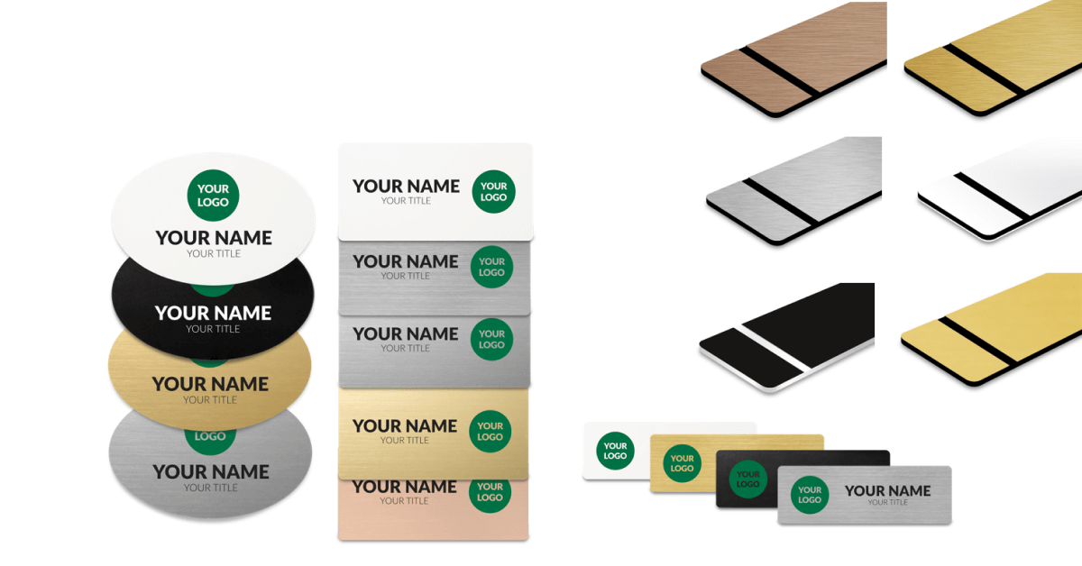
As a hospitality professional, your name badge is a critical element of your uniform, one that is visible to guests and colleagues alike. Your name badge represents not only your identity, but also your establishment's brand. Therefore, choosing the right colors for your hospitality name badge is essential.
In this blog post, we will provide you with tips on how to effectively use color in your hospitality name badge design.
The Psychology of Color
The psychology of color is an essential aspect to consider when designing your hospitality name badge. The colors you choose can evoke specific emotions and influence how people perceive you and your establishment.
For example, warm colors like red, orange, and yellow can create a feeling of warmth and friendliness, making them ideal choices for name badges of hospitality professionals who aim to create a welcoming atmosphere for their guests.
On the other hand, cool colors like blue, green, and purple can create a calming and relaxing effect, making them perfect for spa or wellness center employees.
Another factor to consider when using warm colors is that they tend to grab attention and stimulate the senses. This can be beneficial if you work in a busy hotel or restaurant where guests need to quickly identify employees who can help them.


For instance, a bright red name badge can instantly grab a guest's attention and help them find the assistance they need.
Cool colors, on the other hand, can be used to create a sense of professionalism and trustworthiness. For example, a muted blue or green name badge can give the impression of calm and reliability, making it an excellent choice for employees in the concierge or front desk positions.
It is also worth noting that some colors have cultural or symbolic meanings that can vary by region or industry. For example, in some cultures, the color white represents purity and cleanliness, while in others, it symbolizes mourning.
Understanding the cultural context of the colors you use in your name badge design is crucial in avoiding any unintentional offense or misinterpretation.
Choose Colors That Reflect Your Brand
When designing your hospitality name badge, it is important to select colors that reflect your establishment's brand. Use your brand's colors to create a connection between your name badge and your brand identity. If your establishment's brand uses bold and vibrant colors, consider using them in your name badge design.
Create Contrast for Easy Visibility
The purpose of a name badge is to make your name visible to others. Make sure your name is legible by using contrasting colors. For example, if your background is dark, use a light color for your name or vice versa. Also, avoid using colors that clash or make your name difficult to read.


Use Color to Identify Different Roles
Using color to identify different roles can be a practical way to streamline communication and improve efficiency within a hospitality establishment. By assigning specific colors to different job functions, it allows guests and colleagues to quickly identify staff members and understand their roles.
For example, at a hotel, the front desk staff could wear name badges with a blue background, while the housekeeping staff could have badges with a green background. This helps guests identify who to approach for specific inquiries or assistance.


Similarly, at a restaurant, the servers could wear name badges with a red background, while the kitchen staff could have badges with a yellow background. This helps the front-of-house staff quickly identify which person to communicate with in case of order modifications or other customer needs.
In addition to improving communication, using color to identify different roles can also promote a sense of unity and belonging among the staff. By wearing the same color or badge design, employees can feel like they are part of a team with a common purpose.
However, it's important to note that color choices should be made thoughtfully, as certain colors may have cultural or symbolic meanings that can vary depending on location or demographics.
For example, while red is often associated with passion and excitement in Western cultures, it can be perceived as a symbol of luck or happiness in Asian cultures. Therefore, it's essential to consider the cultural implications of color choices when designing name badges.


Consider Seasonal Colors
Hospitality establishments often celebrate holidays or seasons with special events and decorations. An event that is being hosted by a hotel or resort often utilizes a specific color to help the attendees feel welcomed, creating a more inclusive experience for all. Consider incorporating colours or seasonal elements into your name badge design. For example, use green and red colors for a Christmas event or orange and black for a Halloween event.
Match Your Name Badge with Your Uniform
Your name badge should match your uniform to create a cohesive look. Consider the color of your uniform when designing your name badge. Use colors that complement or match your uniform for a cohesive appearance.


In conclusion, choosing the right colors for your hospitality name badge is essential. By following these tips, you can effectively use color to create a name badge that is not only functional but also visually appealing and representative of your brand.
At Imprint Plus, we offer a variety of hospitality name badges that are customizable and reusable. If you need help designing your name badge, our team of experts is here to assist you. Contact us today to learn more about our products and services.

 Imprint Plus Canada
